AO: We are back from the dead... again! After an 18 day outage, we are finally alive and well. Who knew how complicated updating software/databases from 2008 would be. I still have alot of tweaks to make, but my main goal was getting everything patched and updated to 2026.
Vbulletin 6 has changed alot since 2008 so we will have a ton of new features to dig into.
I've got a really good idea that plays off the old agd logo I would like to share. Also I was a graphic designer in a past life. Does anyone have file of old logos they could send me? [email protected]
Laku, those are awesome and maybe we'll incorporate something like it in a later run. As I've been saying the whole time, all I'm doing is giving everyone else a base to work off of. If you guys want swag to wear to show our colors then it will be up to you guys to grab the ball and run. much like rschoi_07 did (I will say however he dropped A LOT of money to get you guys patches)
Wow its unfortunate someone ran with a design without a conscious. The red star is straight out of socialist China and no self respecting soldier would have it on his uniform. Also i fail to see the corralation it has with Mags and AGD.
Wow its unfortunate someone ran with a design without a conscious. The red star is straight out of socialist China and no self respecting soldier would have it on his uniform. Also i fail to see the corralation it has with Mags and AGD.
Actually i did and still fail to see how this symbol/creed is a representation of AGD or Automags. Never has it been mainstream or used anywhere in association with either. All it will lead to is confusion and whoever wears it to be subjected to explaining what it is each and every time.
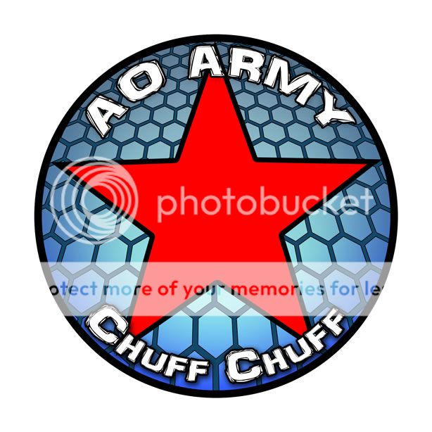
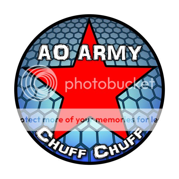
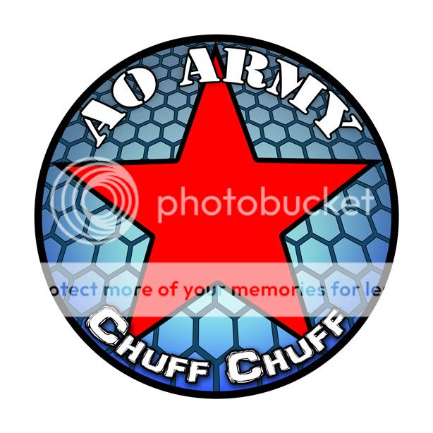
well I based everything on the creed tom laid down in 2009. he was the one who set the logo and since he created AGD and the automag... I think it has alot to do with AGD and the automag
"Our symbol is the red star enclosed in a black circle. The circle represents unity, its color, black, shows that we are an underground community. The points on the red star represent all of the players that do not understand our creed. The points flow into the stars center showing that all are welcome to work with us in seeking to understand the truth. The red color represents that we are active in our communications with others both inside and outside the Revolution."
I think it may have been poorly though out at the time. As was the name Das UnterMag Revolution. The negative associations for both are apparent. The only way it is associated with AGD is that it makes for terrible marketing, which is one of their specialties.
I'm supporting this because I like the idea of AO'ers being able to recognize each other out on the field. If I were advising on this as an art director (former life) I would loose the Star, Circle, Heckle and Jeckle, the word Army, and the AGD lions. I would recommend a new logo (an actual logo, not a piece of artwork or photo-chop of something yanked from the interwebs) based on the Magpie and using the magpie colors (White/Black/Blue). The only thing I would consider retaining would be AO hex's.
It aught to be something completely new since part of the idea is to abolish stereotypes.
the state flag of alabama is a red star. the red star has been used as a symbol of communism but also as a symbol of peace and protest against the nazis. It is sometimes understood to represent the five fingers of the worker's hand, as well as the five continents.
speaking of nazis, the swastika's meaning was literally "to be good" and was used as a symbol of peace. even hitler used it for its literal meaning if not for his own twisted views of peace.
symbols of any type can be used for good or bad, in our case we are using the red star as a symbol that we are willing to educate the players who do not know about our cause and bring them into our family
with that being said... I do believe I have said many times that you guys need to design things for us to use. I just happened to be the first to design something and people liked it so it got made into a patch. I believe if you made something and people liked it and it didn't have a red star in a black circle. it might get made. The fact that these patches are currently getting made are an utter shock to me that I am leading an automag revolution and am being looked up to.
we will have several different incarnations of our logos and mascots. I plan on bringing a variety to it to suit everyone.
Viva la revolucion! Seems like these pop up every 10 years (2003 was the most recent). As much as i love Automags, they wont be mainstream until they are sold again in every local shop. Which isn't gonna happen. But was excited hear about an AO jersey and would enjoy running into.others wearing them.
Call me sentimental but when i think AGD all i see is the double lion logo.
I've always liked the double lions as well. I actually prefer it. But this run of patches was made based off Tom Kaye's description. It wasn't a unilateral decision made by me (or anyone else for that matter). I also think you're reading too much into the whole "socialist" thing.
Anyways, I think a compromise can be made. We're all intelligent (somewhat thoughtful) people here. I suggest to open source the designs, so people can make their own custom patches or what not. It's not that hard. If it means that much to you, you're more than welcome to take on the financial burden.
The lowest common denominator would be to require "AO Army & Chuff Chuff" to be written in large letters somewhere on the patch.


Comment